Measuring Historical Volatility — and Putting It in Context
Objectives
- Compute the close-to-close historical volatility estimator and annualize it with the square-root-of-time rule.
- Explain why range-based estimators (Parkinson, Garman-Klass) are more efficient than close-to-close, and state what each one can and cannot see.
- Interpret a raw volatility number through percentile (HVP) and rank (HVR) against the asset's own history, and explain how they differ.
- Read SV's HV(P&R) / BHV(P&R) output — the color regime, the green squeeze zones, and the smoothed ±SE bands — as evidence about volatility compression and expansion.
You already know how to compute a return. Now you need to measure how much an asset moves — and you will quickly discover two things. First, there is more than one honest way to measure it. Second, and less obvious, the number you get is almost meaningless until you know what is normal for that asset. This chapter builds both halves, because SV's volatility engine — HV(P&R) and its Bayesian sibling BHV(P&R) — is built on exactly that two-step logic: measure volatility carefully, then rank it against its own history so the number finally means something.
Part 1 — Three lenses on one quantity
Volatility is the standard deviation of returns. That textbook definition is correct, but it hides a quiet assumption: that the only data you have is the closing price each day. For most of the history of finance that was true — one number per day, the close. But a modern bar carries four numbers, not one: the open, the high, the low, and the close. Throwing away three of them leaves evidence on the table. The whole story of this first half is how to use more of that bar, and why doing so gives you a sharper, less noisy estimate of the same underlying quantity.
Close-to-close: simple, unbiased, and noisy
The close-to-close estimator is exactly the standard deviation of your log-returns. You take each day's log-return — the log of today's close over yesterday's, — compute the variance in the usual way (the average squared deviation from the mean), and take the square root:
Because a daily number is awkward to compare across assets, you annualize it by multiplying by the square root of the number of trading periods in a year. For daily data that is the square root of two hundred and fifty-two, roughly fifteen-point-nine — so a daily standard deviation of one percent becomes an annualized volatility of about sixteen percent. That square-root-of-time scaling is not a convention someone chose; it falls directly out of the fact that variance adds across independent periods, so standard deviation grows with the square root of time.
Close-to-close is unbiased and simple, and it has one real weakness: it is noisy. It sees only one price per day, so it needs many days of history before the estimate settles down. And it is blind to everything that happened inside the day. An asset that rips up four percent, crashes down four percent, and closes exactly where it opened has a close-to-close return of zero — close-to-close calls that a calm day. Your eyes, and your account, know it was not.
Parkinson: read the range
This is the opening that range-based estimators exploit. The intuition is simple: the day's high minus low is itself a measurement of how violently the asset moved. A wide-range day was a volatile day, regardless of where it closed. If you can read volatility off the range, you extract far more information from each single day — which means you need far fewer days to get a stable answer.
The first and cleanest of these is the Parkinson estimator (1980). It uses only the high and the low : for each day take the log of high over low, square it, and scale by the constant :
Average across your days, square-root, and annualize. The remarkable result, proven under the assumption that price follows a continuous random walk with no drift, is that Parkinson is roughly five times more efficient than close-to-close (the precise factor is ≈ 5.2). "Efficient" here is exactly the word from your estimation chapter: same data, but a lower-variance estimator — its sampling distribution is tighter around the true σ, so to reach equal precision, close-to-close needs about five times as many days. One week of Parkinson can be worth a month of closes.
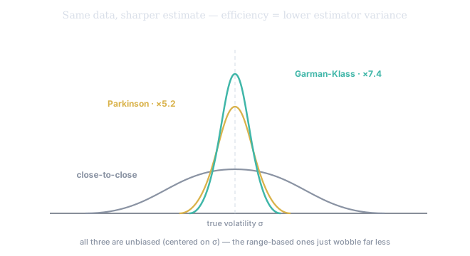
Figure 1. All three estimators are unbiased — centered on the true σ — but they differ enormously in variance. Close-to-close wobbles widely (it reads only one price a day); Parkinson is ≈5.2× tighter and Garman-Klass ≈7.4× tighter, because they wring volatility out of the whole intraday path. This is the bias-variance lesson of Tier 100 ch5, applied: efficiency is the prize.
Parkinson has a blind spot of its own. By using only the high and the low, it ignores the open and the close, so it cannot see gaps — the jump from yesterday's close to today's open — and it has no notion of where the day opened relative to where it ended.
Garman-Klass: use the whole bar
The Garman-Klass estimator (1980) closes that gap. It uses all four prices, combining the high-low range (as Parkinson does) with a correction built from the open-to-close move:
Average and annualize. Under the same idealized assumptions, Garman-Klass is even sharper than Parkinson — its efficiency factor is ≈ 7.4, so roughly seven to eight times more efficient than close-to-close — because it uses all four numbers in the bar instead of two.
Two further refinements are worth knowing by name, because they patch the very blind spots above. Rogers-Satchell (1991) drops the no-drift assumption, giving a range estimator that stays unbiased even when the asset is trending. Yang-Zhang (2000) goes further and is the most robust of the family: it explicitly adds an overnight (close-to-open) term, so unlike Parkinson and Garman-Klass it does capture the gaps — at the cost of more moving parts. The progression cc → Parkinson → Garman-Klass → Rogers-Satchell → Yang-Zhang is a steady trade of simplicity for efficiency and realism.
The divergence between them is itself a signal
So you have three lenses on the same quantity. They are not competitors so much as instruments with different sensitivities, and the relationship between them is itself information. When all three roughly agree, the asset is moving in an orderly, continuous way and your volatility number is trustworthy. When they diverge, the divergence tells you something specific. If Garman-Klass and Parkinson sit far below close-to-close, the asset is gapping — most of its movement is happening overnight, between bars, where the range estimators cannot see it. If the range numbers run hot relative to close-to-close, the asset is whipping around intraday but closing tamely. Reading that spread is the skill of judging whether a volatility number is genuine evidence the asset will move, or an artifact of how the move is distributed across the clock.
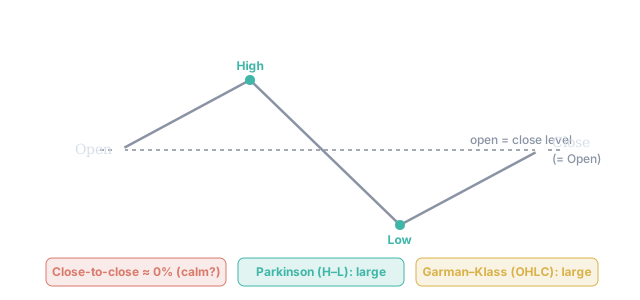
Figure 2. One day that opens, rips to its High, crashes to its Low, and closes exactly where it opened. Close-to-close sees only open-versus-close and reports ≈0% — a calm day. Parkinson reads the high–low range and Garman–Klass reads all four prices; both correctly report a violent day. Throwing away the high, low, and open throws away the evidence.
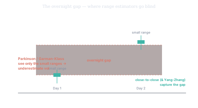
Figure 3. The opposite failure. Here both days are quiet intraday — small high-low ranges — but the price gapped hard overnight between the close and the next open. Parkinson and Garman-Klass, which read only the intraday range, miss the gap entirely and underestimate the true volatility; close-to-close (and Yang-Zhang) capture it. This is why, when the range estimators sit far below close-to-close, the asset is telling you its action is happening overnight.
Part 2 — A volatility number means nothing without context
Here is the move that separates a novice from a desk. Suppose an asset's annualized volatility is twenty percent. Is that high or low? You cannot answer. Twenty percent is sleepy for a small-cap biotech and a screaming alarm for a government bond. Volatility only has meaning relative to the asset's own history. A raw number is a reading on a scale you do not yet have. The fix is to rank today's value against its own past — and that single idea is what turns a raw volatility estimate into SV's HV(P&R): Historical Volatility by Percentile and Rank.
Percentile mode (HVP): how rare is today?
The percentile asks a counting question: of all the volatility readings over a long lookback window, what fraction sat below today's? An HVP of ninety means current volatility is higher than ninety percent of its own history — a genuinely extreme, rare event. An HVP of five means it is calmer than ninety-five percent of its history — unusual quiet. Percentile is the right lens when you want an exact historical comparison: how often has it been this agitated, or this still?
Rank mode (HVR): where in the range?
The rank asks a distance question instead. It normalizes today's reading onto a zero-to-one-hundred scale stretched between the historical minimum and maximum over the window. Where percentile counts how many past readings are below you, rank measures how far you sit along the full span from calmest-ever to wildest-ever. The two usually agree, but they part company in a revealing way: if a single violent spike set the historical maximum, rank gets compressed — most ordinary days now sit low on the min-to-max ruler — while percentile, which only counts, is unbothered. Use HVP to pinpoint rare squeezes and spikes with an exact historical count; use HVR to track the broader regime as a smooth relative measure.
The squeeze: why low volatility is the loudest signal
The most actionable reading is not a high one — it is an extreme low. When HVP or HVR sinks to the bottom of its range, the asset is in a volatility squeeze: it is quieter than it almost ever is. And because volatility both mean-reverts and clusters — a fact you will formalize in the GARCH chapter of Tier 200 — an extreme low is unstable. Compression is stored energy; it resolves into expansion. That is why SV shades these moments green, graded by how extreme they are: light green for a percentile/rank between three and five, medium green between one and three, dark green at one or below. The green is not a buy or a sell — it carries no direction — it is a warning that a move is loading. The mirror image is the red zone, an HVP of ninety and up, which marks climaxes and exhaustion, where the job shifts from hunting entries to managing risk.
Reading it as evidence, not noise
HV(P&R) renders the whole picture as a color-coded histogram — blue below seventy, yellow from seventy to seventy-nine, orange through the eighties, red at ninety and above — so you read the regime at a glance instead of parsing raw numbers. It then smooths the series with an exponential moving average and draws ±1 standard-error bands around it. Those bands do the same job a confidence interval did in your inference chapters: they separate a persistent shift in volatility from a one-day twitch. A reading that pokes outside its own SE band is a real deviation worth acting on; one that stays inside is the series breathing normally.
Part 3 — The Bayesian refinement: BHV(P&R)
There is one more honesty problem to fix. The raw volatility series is itself noisy, and worse, it is biased — a strong trend leaks into the close-to-close estimate and inflates it, because a drifting mean looks like extra dispersion. BHV(P&R) addresses this with a Bayesian bias-detrended volatility (its smoothed core is the nBD moving average), stripping out that contamination before the percentile and rank are computed. The grammar is identical — red for high-stress, high-implied-volatility conditions, green for calm, breakout-ready compression — but the signal underneath is cleaner and more robust to market noise. Reach for HV(P&R) for the direct read; reach for BHV(P&R) when you want the de-noised regime, especially on trending assets where the bias matters most.
A name has been grinding sideways for a month. Its raw annualized volatility reads twelve percent — a number that, alone, tells you nothing. HV(P&R) puts it at an HVP of 4: lower than ninety-six percent of its own past year. The histogram is shaded light green. Nothing here predicts direction — but it is loudly predicting magnitude: this asset is wound tighter than it almost ever is, and squeezes resolve into expansion. That is a setup to size for a move, with the direction supplied by your other tools.
HV(P&R) on any liquid name shows the regime at a glance in its histogram: blue is calm, red (90+) is an extreme spike, and a green background is the prize — a statistically rare volatility squeeze where a breakout is loading. It offers two readings: HVP (the exact historical percentile — best for pinpointing rare squeezes and spikes) and HVR (the smooth min-to-max rank — best for tracking the broader regime). Its EMA and ±1 SE bands separate a persistent regime shift from a one-day blip. On a strongly trending asset, BHV(P&R) gives a different reading: the Bayesian bias-detrending has removed the volatility the trend was faking, leaving a cleaner squeeze-or-stress verdict. Both tools turn a raw volatility number — meaningless on its own — into a statement about where this asset sits in its own history.