Distributions: The Real Shape of Returns
Objectives
- Read a histogram of returns as an empirical distribution, and smooth it into a density.
- Define the four moments — mean, variance, skewness, kurtosis — and compute excess kurtosis.
- State why the normal is the default assumption and name the distributions that fit returns better (Student-t, lognormal, stable).
- Use a QQ-plot to diagnose fat tails and skew by eye, and read the four canonical shapes.
- Test normality formally with the Jarque–Bera idea, and recognize volatility clustering as the GARCH preview.
In the last chapter you built a clean object: the log-return. Now we ask the question that drives almost everything in quantitative finance — what does the whole collection of returns look like? Not any single return, but the entire pile of them. Their shape. Their distribution.
Everything downstream — every risk number, every option price, every "how confident are we" — is really a statement about this distribution. So we are going to look at it honestly, learn the four numbers that summarize it, meet the handful of textbook shapes it might take, and — most importantly — learn a single picture that lets you diagnose the true shape by eye in about three seconds. Take your time here; this chapter is the lens for the entire program.
The histogram: your first honest look
Take every daily log-return for an asset over a few years, sort them into buckets — how many days fell between −1% and 0%, how many between 0% and +1%, and so on — and plot the counts as bars. That picture is a histogram, and it is the most honest first look you can take. It answers the only questions risk really cares about: how often do small moves happen, how often do large ones, and is the asset more prone to lurching down than up?
A histogram has one knob: the bucket (bin) width. Too wide and you blur real structure into a few fat bars; too narrow and random noise makes it spiky. To get a smooth curve instead of jagged bars, statisticians slide a small smooth bump along the axis and add the bumps up — a kernel density estimate (KDE). The histogram and the KDE are two views of the same thing: the empirical distribution — the shape the data itself shows you, before you assume anything.
Underneath both is a precise idea. Sort the returns from smallest to largest; the sorted values are the order statistics. The fraction of the sample at or below any level is the empirical CDF (cumulative distribution function), and the value below which a given fraction of the data sits is a sample quantile — the median is the 50% quantile, the worst 5% of days sit below the 5% quantile. Quantiles are the language of risk (Value-at-Risk, which you meet later, is literally a quantile), and they are the machinery behind the diagnostic plot at the heart of this chapter.
The seductive normal — and its two numbers
When you look at that histogram it has a familiar silhouette: a hump in the middle near zero (most days are quiet) and tails falling away on both sides (big moves are rarer). This shape tempts everyone toward the same assumption, the one underlying an enormous amount of financial theory — the normal distribution, the bell curve.
The normal is seductive for real reasons. It is fully described by just two numbers — its mean (where it is centered) and its standard deviation (how wide it is) — through
It has beautiful mathematics behind it, and much of the machinery you will use later assumes it. So we start there. But you must learn, early and permanently, where it lies to you — because trusting the bell curve blindly is one of the most expensive mistakes in markets. To see exactly where it fails, we need a richer vocabulary than "center" and "width." We need the moments.
The four moments: the shape in four numbers
Any distribution can be summarized — never perfectly, but usefully — by four numbers, each describing one aspect of its shape. They build on each other.
- First moment — the mean : where the pile is centered. For daily returns this is tiny and famously hard to estimate.
- Second moment — the variance , and its square root the standard deviation : how spread out the returns are. This is volatility, the single most important number in the next chapter.
- Third moment — skewness : how lopsided the pile is. Zero means symmetric; negative means a longer left tail.
- Fourth moment — kurtosis : how much weight lives in the tails versus the middle.
The trick with kurtosis is the benchmark. For a normal distribution exactly, always, no matter its mean or width. So we almost never quote raw — we quote excess kurtosis:
A normal has excess kurtosis . Anything with excess kurtosis is called leptokurtic — a taller, sharper peak and fatter tails than the bell curve. Anything with excess kurtosis is platykurtic — squatter, thinner-tailed. Financial returns are emphatically leptokurtic, often with excess kurtosis of 5, 10, or far more on daily data.
You never know the true moments — you estimate them from observations. The sample estimators are exactly what they sound like: average the relevant power of the deviations,
Notice the powers: skewness cubes the deviations, kurtosis raises them to the fourth power. That is why a single huge day moves enormously — the fourth power magnifies outliers. The moments are not abstract; they are exactly what makes the tail dangerous show up as a big number.
Where the normal lies: fat tails
Real returns have fat tails — that positive excess kurtosis made visible. The idea is simple: extreme moves happen far more often than the normal predicts. The bell curve says a five- or six-sigma day should essentially never occur — once in many thousands of years. Markets produce them every few years. The "hundred-year flood" arrives every decade. If you size your risk with a model that thinks catastrophes are impossible, the catastrophe does not care about your model.
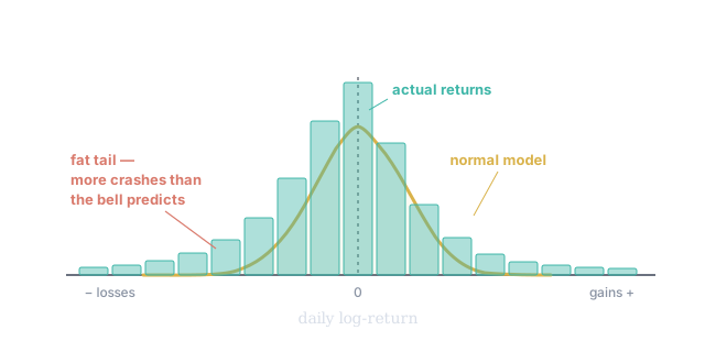
Figure 1. The empirical return distribution (teal bars) against a fitted normal (gold). Two departures the bell curve hides: a taller peak — more calm days than "normal" expects — and fatter tails, where extreme moves (especially down, the longer left tail) occur far more often than predicted. That tail gap is, literally, the risk the bell curve forgets — it is the positive excess kurtosis, drawn.
There is a deeper reason fat tails are so dangerous, and it is worth stating precisely because it governs how losses actually arrive. For a fat-tailed (technically subexponential) distribution, a large total loss across many positions or many days tends to come from one enormous move, not from many moderate ones adding up — the "single big jump." This is the opposite of the normal world, where a big sum is built from lots of small contributions. It is why one position, one day, one event can dominate a year of careful gains, and why diversification quietly fails exactly when you need it. The mathematicians who formalized this (Embrechts and colleagues, in extreme-value theory) gave us the tools you will use in Tier 400 to model the tail on its own terms.
A small zoo of better shapes
If not the normal, then what? A few distributions recur throughout finance, each fixing one of the normal's lies:
- Lognormal — the natural model for prices. If log-returns are roughly normal, then prices (their exponential) are lognormal: never negative, right-skewed. This is the assumption behind Black–Scholes and behind SV's Normal Cone projections you met in passing last chapter.
- Student-t — the workhorse for fat-tailed returns. It has one extra knob, the degrees of freedom , that controls tail heaviness: small (3–6, typical for daily returns) means heavy, outlier-prone tails; as it collapses back to the normal. It is the single most common upgrade from the bell curve.
- Stable / Paretian — Mandelbrot's 1960s proposal for cotton and other prices, with tails so heavy the variance can be infinite. Mathematically elegant, practically awkward, but historically the first serious admission that returns are wilder than normal.
- Scale mixture of normals — the intuitive bridge: imagine a normal whose variance itself is random, changing day to day. Mixing normals of different widths produces fat tails automatically. Hold that thought — it is the seed of GARCH and stochastic-volatility models, and the reason SVQ's surfaces breathe.
Skewness: which way the surprises come
Returns are not only fat-tailed; they are often skewed — lopsided. Many assets grind slowly upward on most days and then crash violently on a few. That is negative skew (): a long, heavy left tail. The everyday experience of holding such an asset feels calm — which is precisely the danger, because the calm is paid for by the rare, severe drop.
Skew tells you which direction the asset's surprises tend to come from, and it is directly relevant to your eventual trading question — is this evidence the asset moves up or down? An asset with heavy negative skew is telling you something about the kind of move it is prone to, not just its average. In options it has a price: the persistent richness of downside puts (the "volatility skew") is the market charging for exactly this asymmetry.
The QQ-plot: diagnosing the shape in one picture
Histograms are honest but blunt — it is hard to judge a tail by eye when the bars there are tiny. The professional's tool is the quantile–quantile plot (QQ-plot, or normal probability plot). The idea is elegant: plot your sorted returns (the sample quantiles) against the values a perfect normal would have produced at the same positions (the theoretical quantiles). If the data were truly normal, the points fall on a straight line. Every departure from that line is a specific, named flaw.
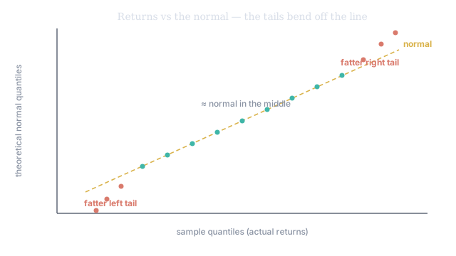
Figure 2. A QQ-plot of real returns against the normal. Through the middle the points sit on the line — the everyday range really is roughly normal. But at both ends they bend away from the line: the extreme days are more extreme than the normal allows. That two-ended bow is the visual fingerprint of fat tails, and it is far easier to read here than in a histogram's nearly-empty tail bars.
The power of the QQ-plot is that the shape of the deviation names the problem. With the sample quantiles on the horizontal axis, there are four canonical patterns:
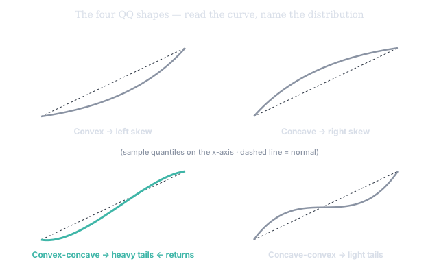
Figure 3. The four QQ shapes. Convex → left-skew. Concave → right-skew. Convex-concave (the gentle S) → heavy tails — this is what equity and crypto returns look like. Concave-convex → light tails. Learn this one panel and you can classify any return series by glancing at its normal plot.
Two practical cautions. First, a reference line is usually drawn through the first and third quartiles (the 25% and 75% points) so your eye has something straight to judge against. Second, sample size matters: even genuinely normal data wiggles off the line a little, and it wiggles most in the tails, where there are fewest points. With 50 observations expect noise; with 5,000 the verdict is clear. Don't over-read a kink built from three data points.
Testing normality formally: Jarque–Bera
The eye is good; sometimes you want a number. Here the moments pay off directly. Under the normal assumption, the sample skewness and sample excess-kurtosis have known sampling spreads:
So you can ask "is the skew significantly non-zero?" and "is the excess kurtosis significantly non-zero?" as ordinary tests, then combine them into one statistic — the Jarque–Bera test:
which behaves like a with two degrees of freedom when the data really is normal. A large JB (small p-value) is the data telling you, with a straight face, I am not normal. For almost any real return series of meaningful length, JB rejects normality overwhelmingly — which is the whole point of this chapter, stated as a hypothesis test.
Fitting the real shape in practice
Knowing returns aren't normal, the practitioner fits a better law. The standard upgrades are the Student-t (one tail-heaviness knob ), the skew-t (a t with an added asymmetry knob, capturing fat tails and negative skew together), and the generalized error distribution (GED, whose shape parameter slides smoothly from fat-tailed through normal to thin-tailed). You fit one of these to the returns, read off the tail and skew parameters, and now your risk numbers reflect the asset's actual behavior instead of a comforting fiction. This is precisely what SVQ does under the hood when it characterizes an asset's distribution rather than assuming a bell curve.
The feature the histogram hides: volatility clustering
One last departure, and it is the bridge to the advanced tiers. Look at returns in order rather than as an unordered pile and you notice that big moves cluster. Volatile days arrive in groups; calm days arrive in groups. A wild session is usually followed by more wild sessions, not an instant return to quiet. This is volatility clustering: the spread of returns is not constant — it changes over time, and it is partly predictable.
That single observation is the seed of the GARCH family you study in Tier 300 (and it connects straight back to the scale-mixture idea: a normal with a time-varying variance produces both clustering and fat tails at once). It is also why the volatility surfaces in SVQ are not flat, dull objects but living, shifting ones.
The honest summary
The bell curve is where we start because it is simple and tractable. But real returns are fatter-tailed (positive excess kurtosis), often skewed (usually negative), and clumped in time (volatility clustering). Every one of those three departures is not a nuisance — it is information, and it is risk. Learning to see them — in a histogram, in a QQ-plot, in a Jarque–Bera number, in SVQ's output — is learning to see the danger the naive eye and the naive model miss entirely.
SVQ's return distribution view overlays a normal curve on each asset's histogram, and its QQ view plots the same data against normal quantiles. Together they show this chapter's three lessons at once: the peak sits taller than the bell (leptokurtic), the tails bow off the line (fat tails), and any lean reveals the skew. Beside them sits the risk-neutral density (RND) the options market implies for the same name — and its left tail is fatter and pushed out: the market is pricing the negative skew and fat tails measured in the history. SV's HV(P&R) then places today's spread in the asset's own volatility regime — the clustering, made operational.